BRANDING
STYLE GUIDELINES
Having a consistent look reinforces the strength and professionalism of the Simplura identity.
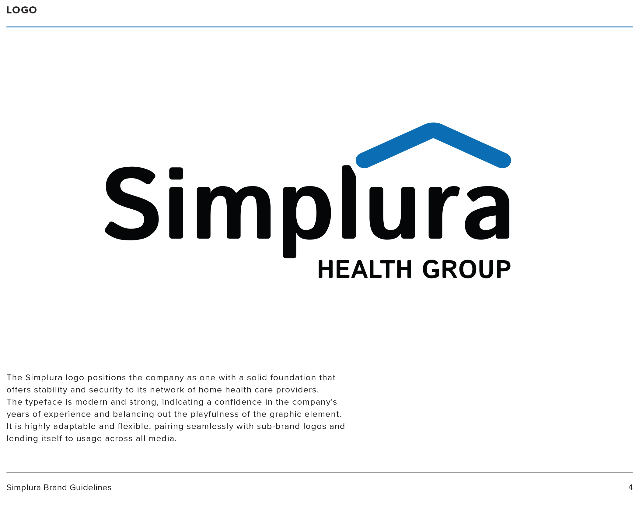
The Simplura logo positions the company as one with a solid foundation that offers stability and security to its network of home health care providers.
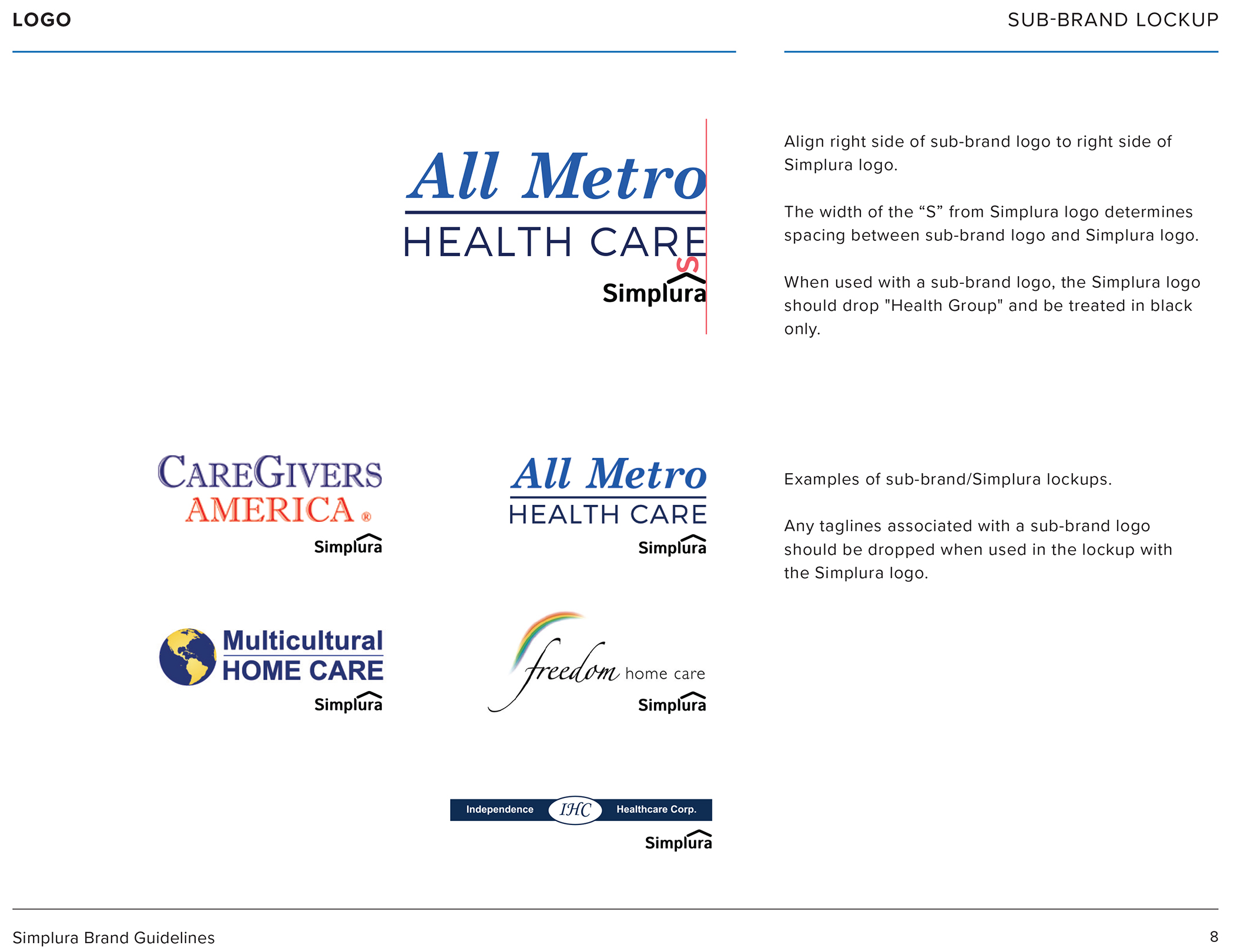
The typeface is modern and strong, indicating a confidence in the company’s years of experience and balancing out the playfulness of the graphic element. It is highly adaptable and flexible, pairing seamlessly with sub-brand logos and lending itself to usage across all media.
Branding guidelines will ensure that Simplura is represented with visual consistency throughout all printed and web based materials.
BRANDING
Create an identity for a Health Care Group which consists of 7 brands and have operations in 7 states on the East Coast. In creating a unified message & a unique culture, we educate new hires as to our vision and mission.
EDUCATION
Learn more as to who we are. Educate & retain quality employees. Recruitment, training, & retention is key in this segment of the healthcare market.
DESIGN
The 2D design elements are modern and strong, indicating a confidence in the company's years of experience and balancing out the playfulness of the graphic element.
VIDEO
Orientation pieces, trainings, marketing collateral, social media postings. All of these combine to create a modern vibe for a modern company.
BRANDING
WHO IS THE SIMPLURA HEALTH GROUP?
This video is a large part of a branding campaign for the Simplura Health Group. I am creating a new hire / orientation video which I shot, edited, recorded, & designed. The executive team & I crafted the script. I created a piece which is meticulous, informative, and detailed. I also wanted to create something cinematic and expansive, which would give an impression of a polished company which you want to work for.
Related Posts